Mastering Multi-hued Color Scales with Chroma.js
tl;dr: Use this tool or chroma.js’ bezier color interpolation and lightness correction.
Probably one of the most useful things about Cynthia Brewers color advice for cartography are the multihue color schemes. This post explains how you can create your own, using two new features of chroma.js: Bezier interpolation and automatic lightness correction.
Why multi-hue?
While a (linear) variation in lightness is the most important quality of a sequential color scale, varying the hue can bring further significant improvements. Hue variation provides a better color contrast and thus makes the colors easier to differentiate. Also I feel that it makes them look a little more aesthetic. This is why the multihue color schemes were included in ColorBrewer, and in the related paper the authors also pointing out that ”they are more difficult to create than single-hue schemes because all three dimensions of colour are changing simultaneously“.
Why is it difficult to create a (good) multi-hue scale?
The straight forward approach to create a multi-hue color scheme is to just pick two colors of a different hue as start end end color for the gradient. Interpolating in CIE Lab* ensured that we end up with a linear lightness gradient, so the scheme is valid to use in visualizations and maps. But still the result is not 100% satisfying. The colors in the middle steps tend to look a little desaturated, especially if we compare this to the nice multi-hue schemes in ColorBrewer.

In some cases the gradient doesn’t even go where we want it to go. For instance, in the following yellow–blue gradient we might want the colors to go through some nice green tones, but instead we get this kind of grayish purple tones.

Introducing additional color-stops is dangerous
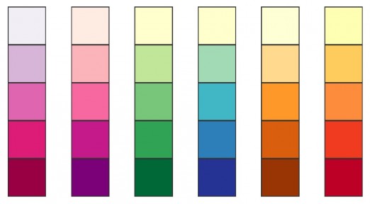
So to get to better multi-hue schemes we most likely end up introducing additional color stops, and this is where the real trouble starts. The main problem of constructing such a multi-hue, multi-stop color scheme is how to pick the middle colors. To illustrate this problem let us look at a palette sometimes used to visualize temperatures: starting with black the gradient goes through red and yellow and finally ends in white.

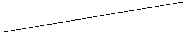
You might already see the problem with this, but for further illustration I visualized the lightness profile of the gradient. The plot shows the L* value for each color after converting to CIE Lab*. In this case the curve’s slope is varying radically at the color stops. After the gradient has passed yellow we see almost no increase of lightness anymore which makes it almost impossible to differentiate colors in the last quarter of the scale.
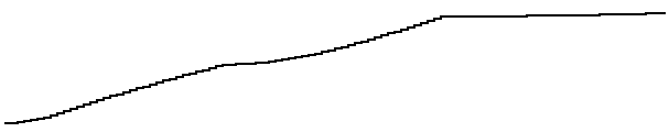
This gets even more obvious when picking a set of 7 equidistant colors of that gradient. The third and fourth colors as well as the fifth and sixth colors are almost identical. Using these colors in a map is definitely not a good idea, as it would make it very hard to read the values.

As you can imagine, it doesn’t matter if we interpolate in RGB or Lab*, as we still would have the hard breaks in the lightness curve. This is because the breaks are not the result of the color space, but of the linear interpolation between the color stops. One way to fix it is to use a non-linear interpolation instead.
Smoothing multi-stop gradients using Bezier interpolation
If the hard edges are causing the problem with the gradient, why not just smooth them by using a non-linear interpolation, such as quadratic or cubic Bezier curves. The first and last colors are the start and end point of the curve, while the other colors are just treated as control points for the curve. In the previous example we would have two control points (red & yellow) and would interpolate using a cubic Bezier curve.1
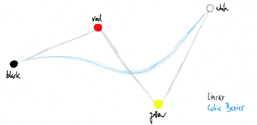
Although the above illustration suggests that the colors lie in a two dimensional space, this is of course not the case. Instead the Bezier interpolation is applied for each of the three dimensions of the CIE Lab* space. As bezier curves usually don’t pass the control points our resulting gradient will not include the colors red and yellow. But still they will ‘guide’ the gradient on its way from black to white. Here’s how the resulting gradient would look like, along with the resulting lightness curve.

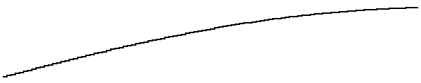
As you can see, the resulting gradient has indeed a much smother lightness curve. Taking seven equidistant steps of the gradient we now end up with nicely differentiable colors. Of course you can achieve the same gradient with linear interpolation, just as you can approximate a cubic Bezier curve with linear segments. But using the control points is much easier than finding the actual stops.

Here’s another example simulating the ColorBrewer schemes Yellow-Green-Blue and Red-Yellow-Blue.


During the writing of the initial version of this post, more precisely right after I first visualized the lightness profile, another simple idea for improving the color gradients popped up.
Auto-correcting the lightness
Looking at the lightness curves shown above, we intuitively know what we are aiming for: a straight lightness transition between the start and the end of the gradient. If the gradient is defined as a function over a variable t ∈ [0..1], we just need to fix the _t _in such a way that the lightness curve ends up being a straight line. In other words we just “move” the colors along the gradient so that they end up with a linear lightness curve. Applying this correction to the black–red–yellow–white gradient (top) we end up with this:
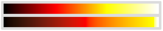
In the corrected version (bottom), red has moved from the first third to about the center of the gradient, while yellow ended up almost at the end of it. This makes sense as yellow is indeed a much brighter color. Looking at equidistant samples from this gradient we now see nicely differentiable colors, safe to be used in maps and visualizations.

As second example I applied the lightness correction to the Yellow-Green-Blue color scale example from above. If you compare the results to the Bezier interpolated version you see that this version is slightly more saturated.


Combining Bezier interpolation and lightness correction
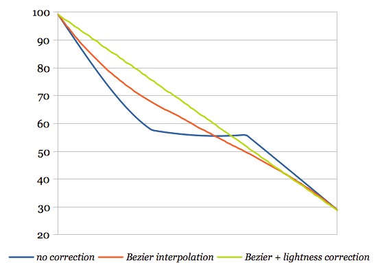
Judging from these first experiments, I think both techniques are producing quite promising results. Finally, one can apply both the Bezier interpolation and the lightness correction. The following example shows a gradient of lightyellow–orangered–deeppink–darkred with (1) just linear Lab* interpolation, (2) cubic Bezier interpolation, (3) lightness correction, and (4) Bezier interpolation and lightness correction.
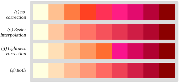
Even though the Bezier interpolated scale already had an almost linear lightness profile (shown in red), the additional lightness correction slightly improved the differentiability of the resulting colors. Please click on the image above to experiment with the example yourself.
How to use these features in chroma.js
First of all, if you just need the hexadecimal values of a nice color scale, you can start playing with the Chroma.js Color Scale Helper right away (if you haven’t done already). All the examples in this post were created using this tool, and are linking back to it with the corresponding settings.
To use the Bezier interpolation in chroma.js you just create the interpolator function by callig chroma.bezier() with an array of colors as first argument. The interpolator function can be called with a number between 0 and 1 as argument, and will return a chroma.color object.
var bez = chroma.bezier(['white', 'yellow', 'red', 'black']);
// compute some colors
bez(0).hex(); // #ffffff
bez(0.33).hex(); // #ffcc67
bez(0.66).hex(); // #b65f1a
bez(1).hex(); // #000000
The interpolation method depends on the number of colors in that array: if you pass two colors linear interpolation is used, if you pass three colors a quadratic Bezier curve is used, and if you pass four colors a cubic Bezier curve is used. Five colors is a special case where two independent quadratic Beziers are used for the colors (1,2,3) and (3,4,5), which is ideal for diverging color scales.
To use the Bezier interpolation with chroma.scale you just pass the interpolator function instead of the colors array. Since the Bezier interpolator uses Lab* by default, the scale mode is being ignored.
chroma.bezier(['white', 'yellow', 'red', 'black']).scale().colors(5);To use the lightness correction you just call scale.correctLightness() of any chroma.scale object. It is important to note that the lightness correction only works for sequential color scales, where the input colors are ordered by lightness. So this won’t work for diverging color scales, yet. But I might fix this in the future.
chroma.scale(['white', 'yellow', 'red', 'black']).correctLightness();If you’re interested in the implementation of the features, here’s the CoffeeScript source code of the Bezier interpolation and the lightness correction. Hope you enjoyed this post, and as always, I’m curious to read what you think about it in the comments.
Update: diverging multi-hue color palettes
An updated version of my tool now allows to create multi-hue diverging color palettes that perform the color interpolation and lightness correction separately for both sides of the diverging scale. Feel free to fork the tool on Github. 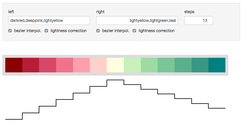
- Aside: if you’re interested in learning more about how Bezier curves work I highly recommend looking at and playing with Jason Davis’ interactive Bezier curve illustration↩