Making Pictographs? Choose Your Icons Wisely!
Icons are widely used in infographics such as maps and pictographs. So as a visualization designer, you’ll get to the point where you must choose which icons or pictograms to use. But please, choose wisely. The reason I got to this topic is a recent post by Naomi Robbins about two opinions on the usefulness of pictographs.
She reminded me of a critical article by Stephen Few, who stated that unit charts (another term for pictographs) are for kids, but not for serious information displays. My biggest complaint about his article is that he picked some of the worst imaginable examples to back up his arguments. Let’s take a closer look at two of them:
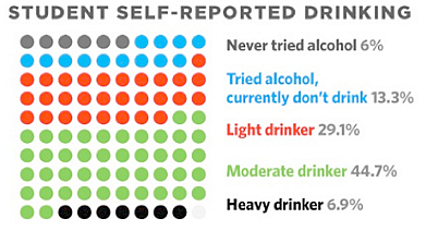
In the first chart, each circle represents one percent of students who have been asked about their drinking behaviors. The color indicates to which category the student belongs. In another example, each stickman represents one million Americans, and the color shows whether these people would be in health insurance.
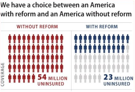
Now, both examples are really terrible infographics for many, many reasons, but for now, let’s focus on the quality of the pictograms. In both cases, the authors picked icons that hardly represent their data. The whole point of using pictograms is to allow the reader to understand the subject without reading the legend or the by-text.
This is what enables kids and people from different cultures or educational backgrounds to read the chart, this is what makes them universal.
So if you want to represent drunk students as icons, why not choose an icon of a drunk student instead of a meaningless circle? And instead of neutral stickmans — which could by the way be easily mixed up with Republicans and Democrats due to the color choice—one could use icons that represent people with and without health insurance. As you probably know, there are plenty of resources where you can find icons (and I’ll add a list at the end of this post), but what if you can’t find a drunken student?
Can’t find the right icon? Ask a graphic designer!
That was exactly the problem Otto Neurath had in 1926 when he planned to create a new system for representing statistics using pictograms: ISOTYPE. And do you know what he did? He looked out for a talented graphic designer. In an exhibition in Düsseldorf, he found Gerd Arntz who was showing his wood-cuts such as Metropa, and asked him the legendary question: ’How much do you cost?’. Finally, they worked together for the next 20 years. During that period, Arntz has drawn an impressive number of icons that have influenced graphic designers until today.
![]()
So seriously, if you want to represent data using pictograms/icons, you want to work with graphic designers. Unlike Neurath, you don’t need to start from scratch, but chances are that you’ll need new or at least slightly modified pictograms.
Take care of the arrangement
Besides the choice of icons, you need to take care about how you actually arrange them. For instance, in the student-drinking examples shown above, the circles are arranged in a grid of 10 times 10. In the insurance example, the arrangement was even worse, as it shows 12 icons per row.
To find out the exact numbers, you have no other option but to count the icons one by one. That’s why both authors finally decided to write down the numbers (which is a good indicator for poor pictographs).
Instead, you can group the icons in a more meaningful way. In the following chart by Neurath, each icon represents 25,000 unemployed in Berlin. They are arranged into groups of four which makes it easier to decode the numbers. In an earlier version, they used one icon to represent 10,000 unemployed, but this ended up with too many icons, so they went for 25,000.
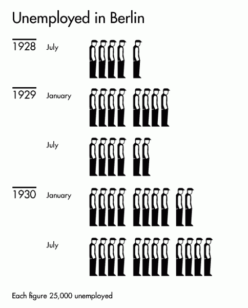
By the way, have you noticed the fact that the unemployed are faced to the right which makes them look as if they were standing in a queue? That kind of visual storytelling is the unique power of pictographs.
Let the pictograms tell the story
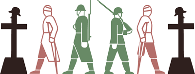
Let’s have a look at one of my favorite Isotype charts by Neurath and Arntz. It shows statistics about soldiers in the First World War. Each figure represents 1 million soldiers, grouped into the ones returning home, the wounded and the killed. The icons are facing opposite directions which makes clear that they are opponents returning home after war (or not in case of the killed).
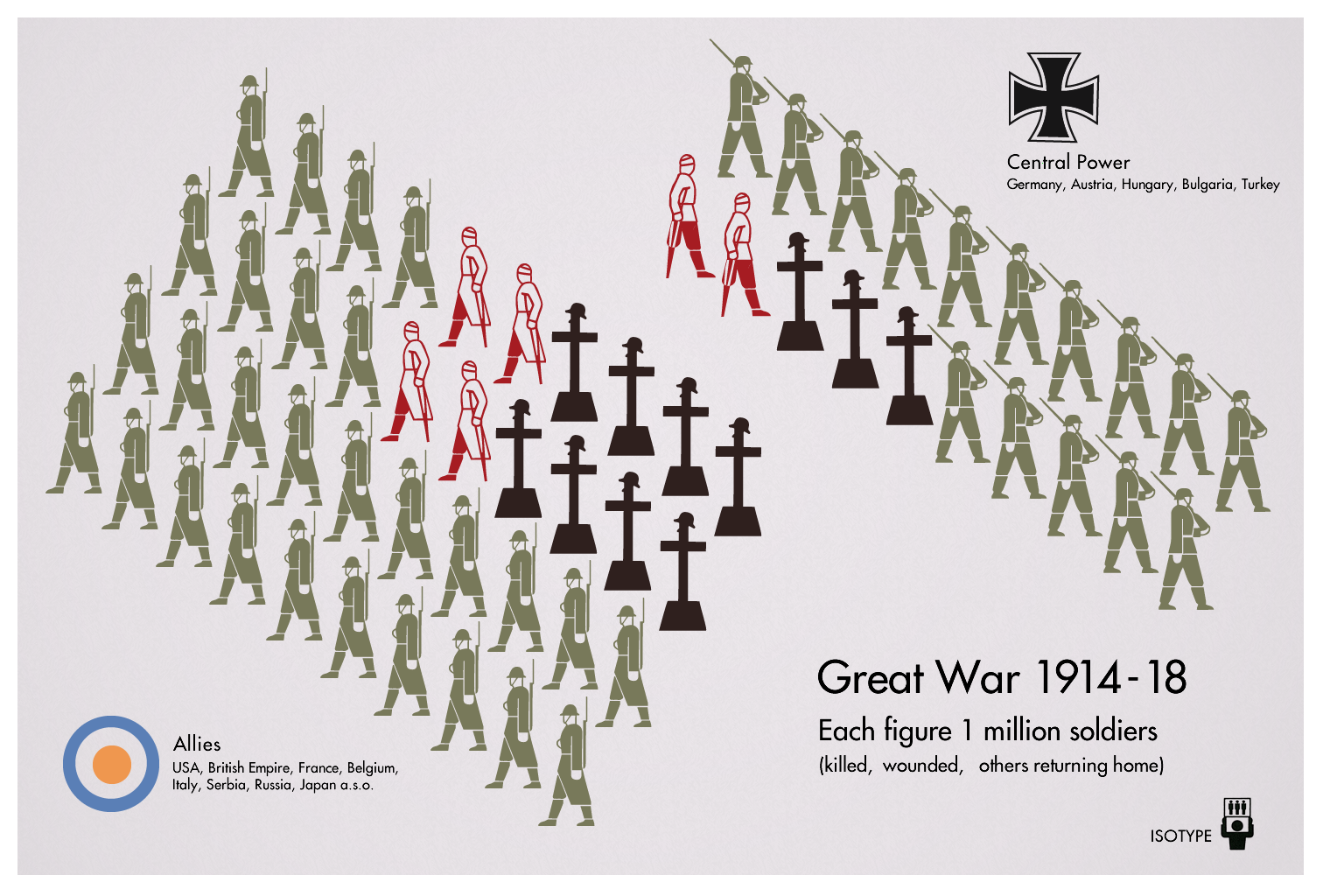
Now take a closer look at the pictograms. Have you noticed that Neurath used different icons for both sides, accounting for the different uniforms and habits of the armies? These are the little details that make the difference!
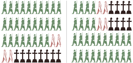
Note that the arrangement of the groups was an important design choice, too. As shown in the following image, the chart would have been less readable if the authors had used the straight-forward arrangement (left) instead of the ‘squarified’ version (right). You don’t really need to ‘count’ the gravestones if there shown in two rows of four.
The choice depends on your goals
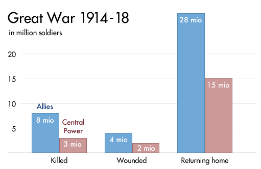
It’s not hard to guess what Stephen Few would recommend to visualize the WW1 soldiers: a bar chart. So let’s compare the Isotype chart to a bar chart. It tells a different story and represents the data in a more neutral way. Yes, it makes it easier to actually compare the killed/wounded for each side. But I’d say that it’s a lot harder to recall any of the numbers the day after seeing the chart.
So, of course, the choice of visualization technique largely depends on the specific goals you’re trying to achieve with the chart. As explained in depth by visualization expert Noah Iliinsky, we need to differentiate at least between exploration and explanation, or in other words between analysing data and communicating data.
One is needed for business intelligence, which is where Stephen Few comes from, the other is needed for education, which is what Otto Neurath dedicated his life to. And here’s one thing we always need to keep in mind: If you want to criticize a visualization technique in general, you need to argue against the best-executed examples you can find. Can’t blame the bar chart for Foxnews.
Further reading and icon resources
- Gerd Arntz Graphic Designer — A highly recommended book about the work of Gerd Arntz, including lots of his wood-cuts, pictograms and Isotype charts.
- The Transformer: Principles of Making Isotype Charts — A small book with more details and first hand explanation about the process of transforming numbers into Isotype charts, written by Neurath’s wife Marie Neurath.
- The Noun Project — A website that collects free pictograms. In a way, this project is dedicated to continuing the work of Neurath and Arntz, which is to develop of visual language that can be understood around the world. The Noun Project goes beyond simply collecting icons by organizing decentral Iconathons, events where people come together to draw icons about specific topics. A great resource!
- Iconmonstr — Another pictogram website, very similar to The Noun Project.
- and of course, please check out Gerd Arntz website which shows many of his pictograms and additional resources about his work.